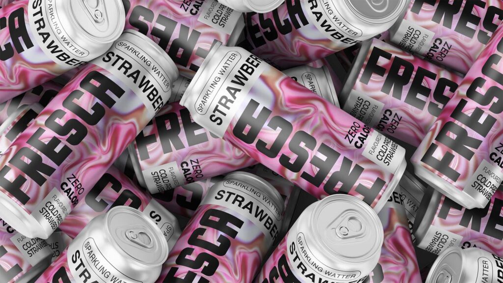
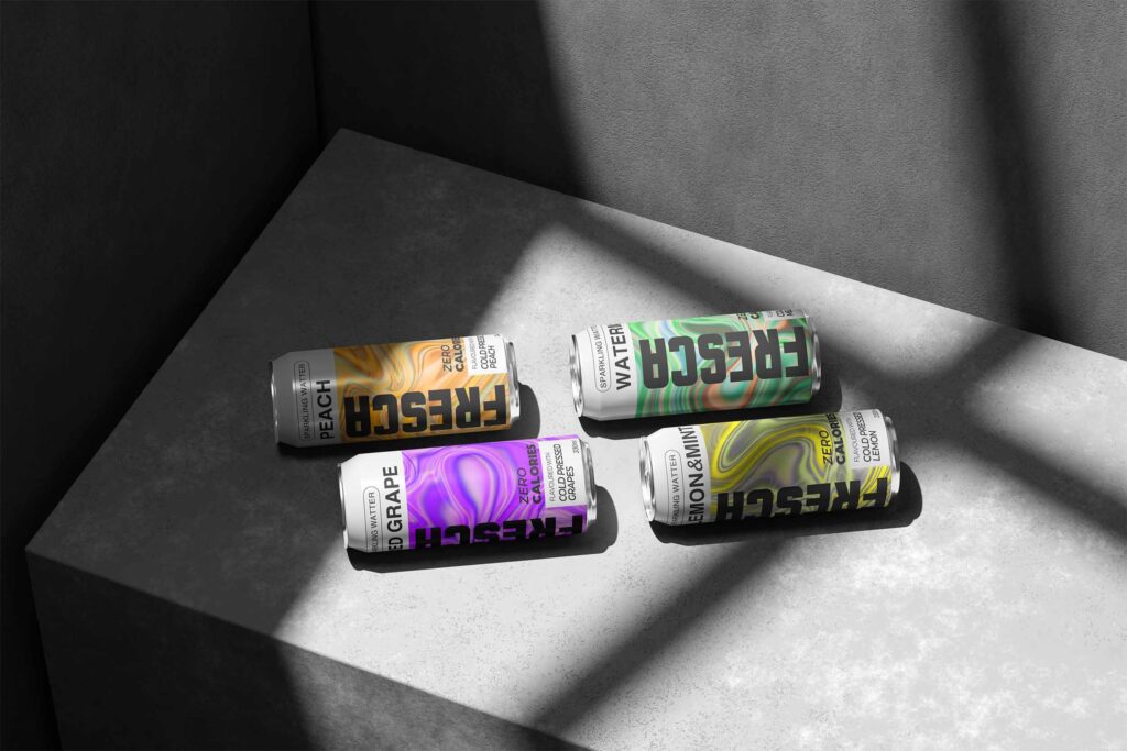
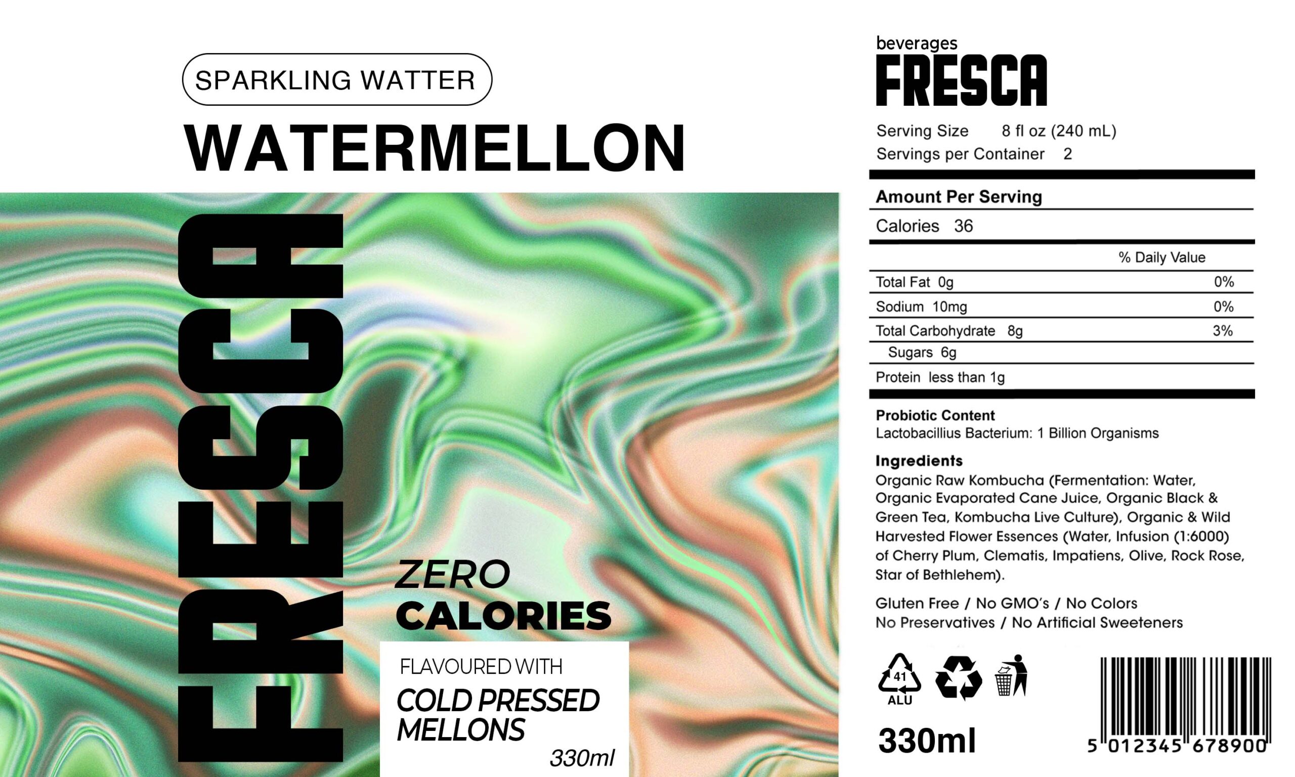
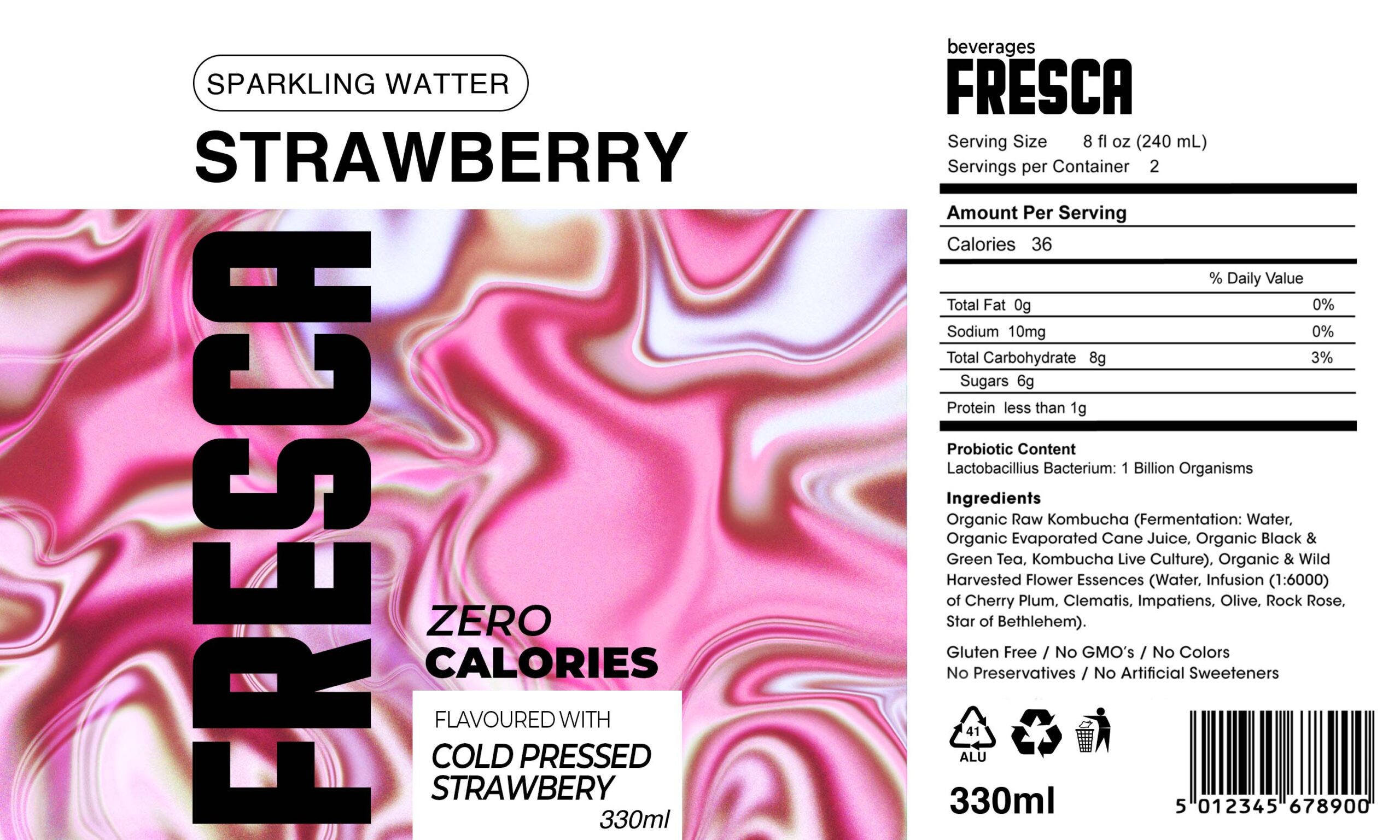
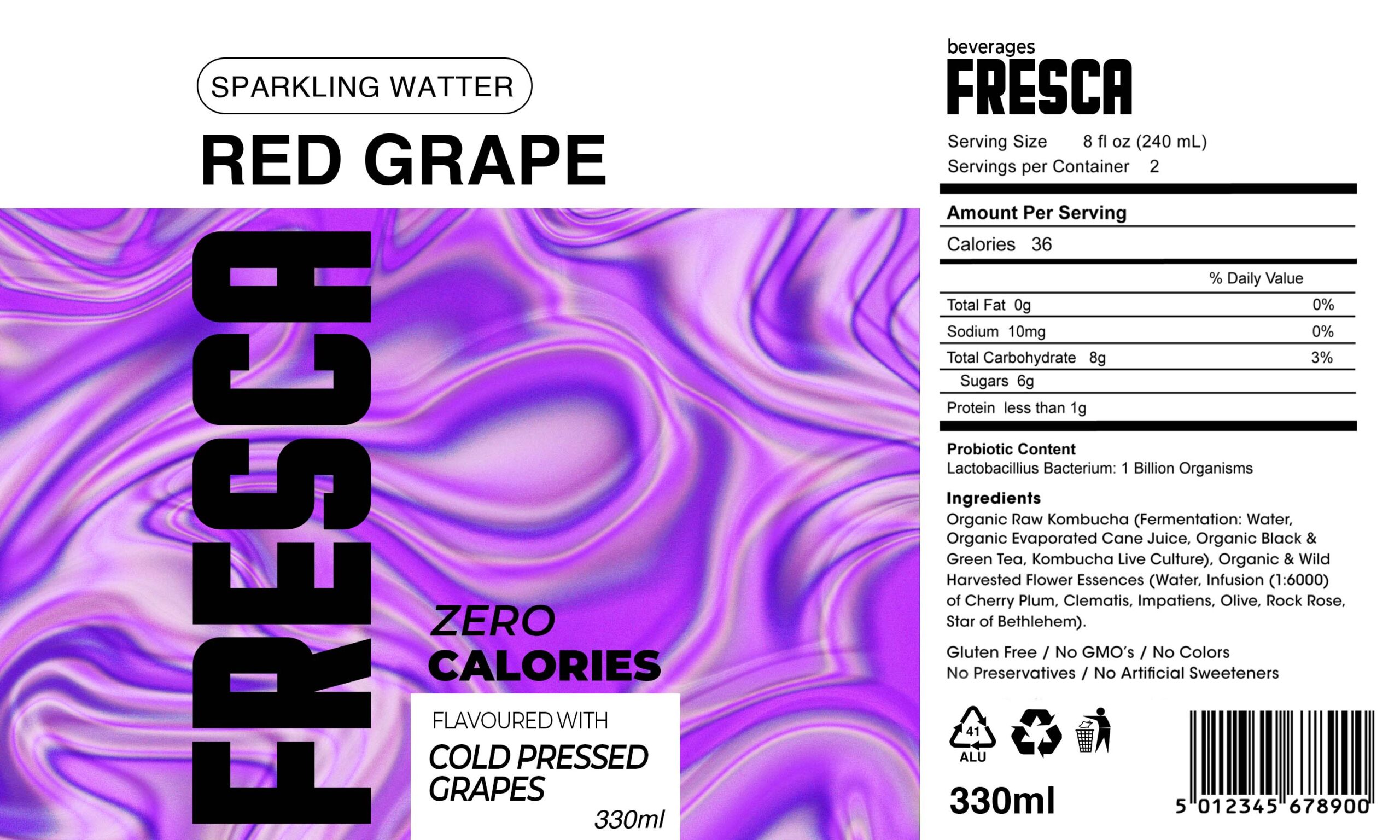
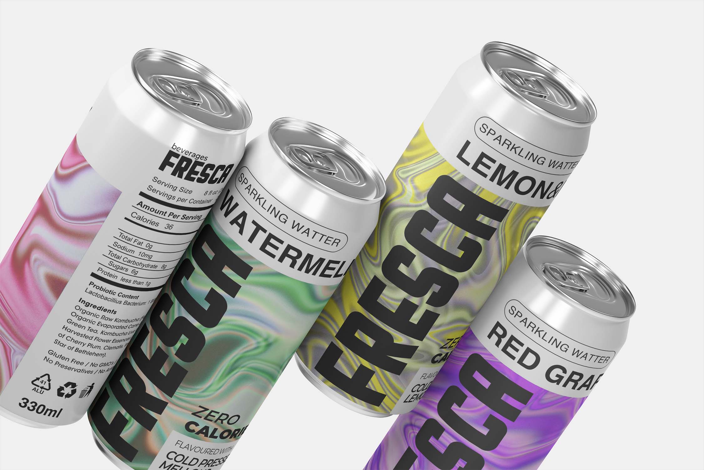
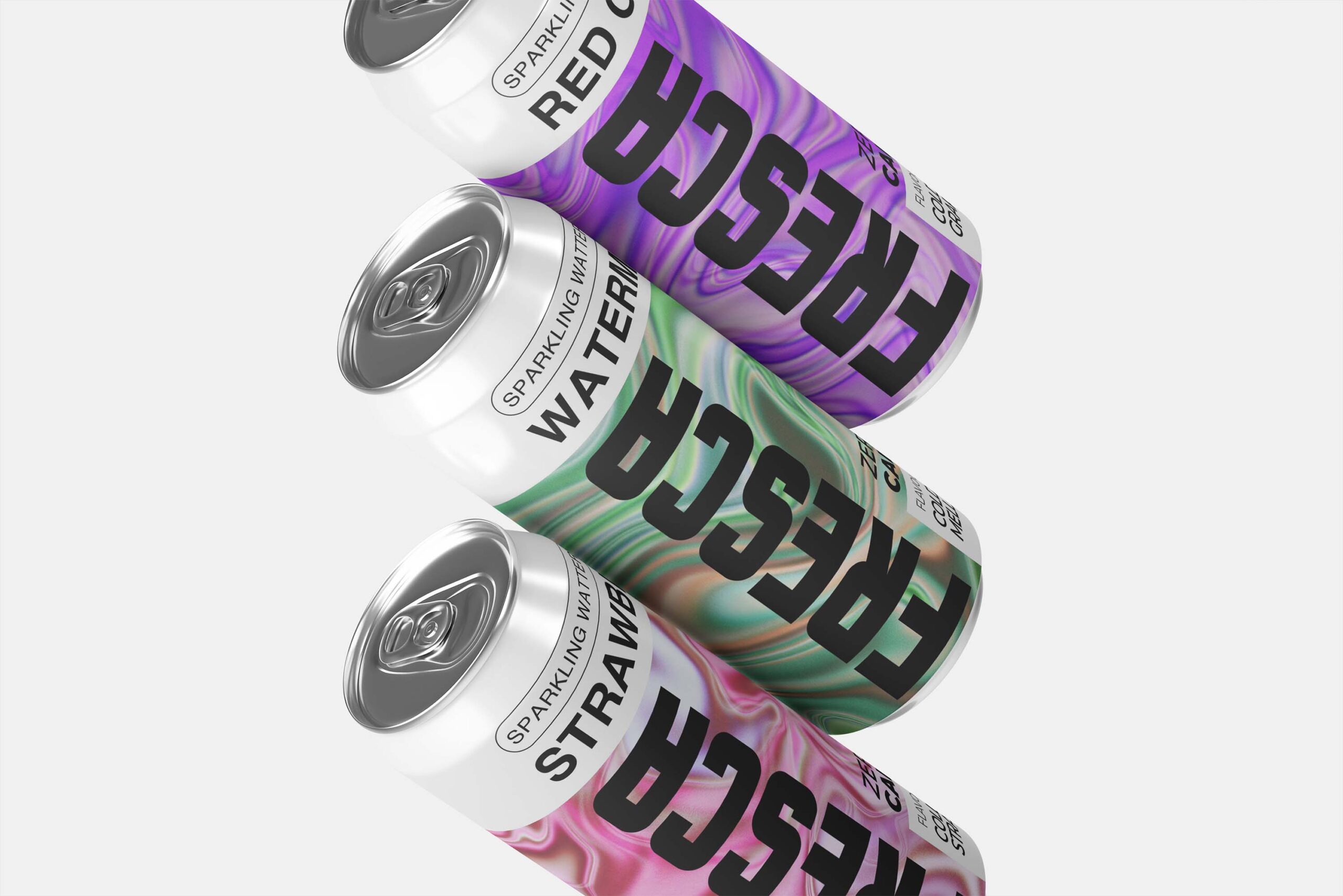
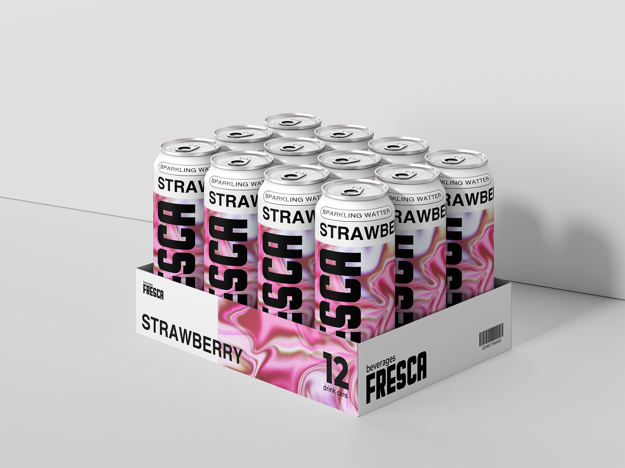
The packaging and identity revolve around fluid, iridescent backgrounds in bright, translucent tones that reflect each flavor—citrus hues for lemon, soft reds for berries, cool greens for mint-based variants, etc. Minimal typography and clean layout let the color and texture shine, creating a sleek and modern presence on the shelf. The bottle design itself emphasized transparency and lightness, echoing the clarity of the product inside. This visual system was extended across digital media, social posts, and point-of-sale materials to build a consistent, taste-forward identity.